Visual Identity – Biscuit
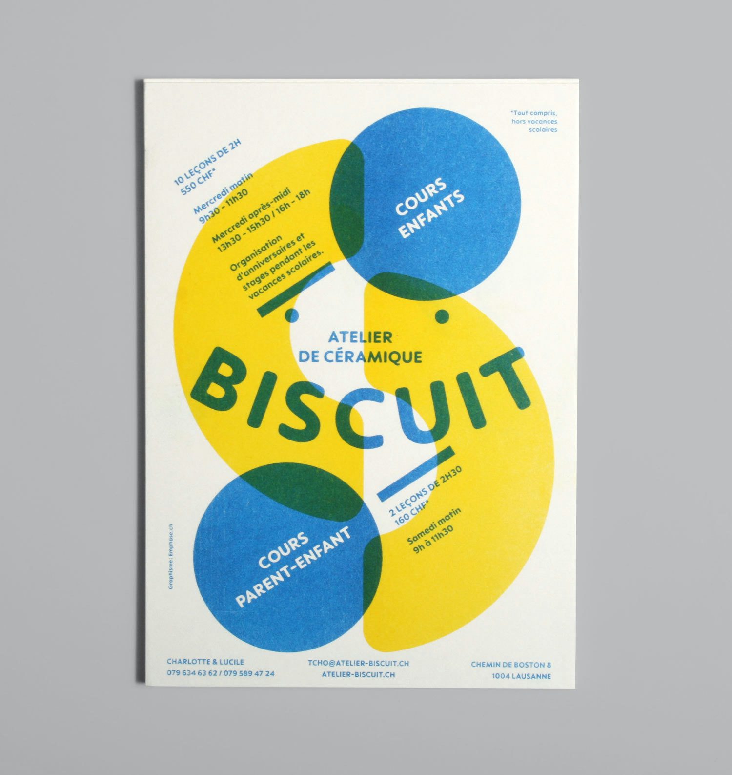
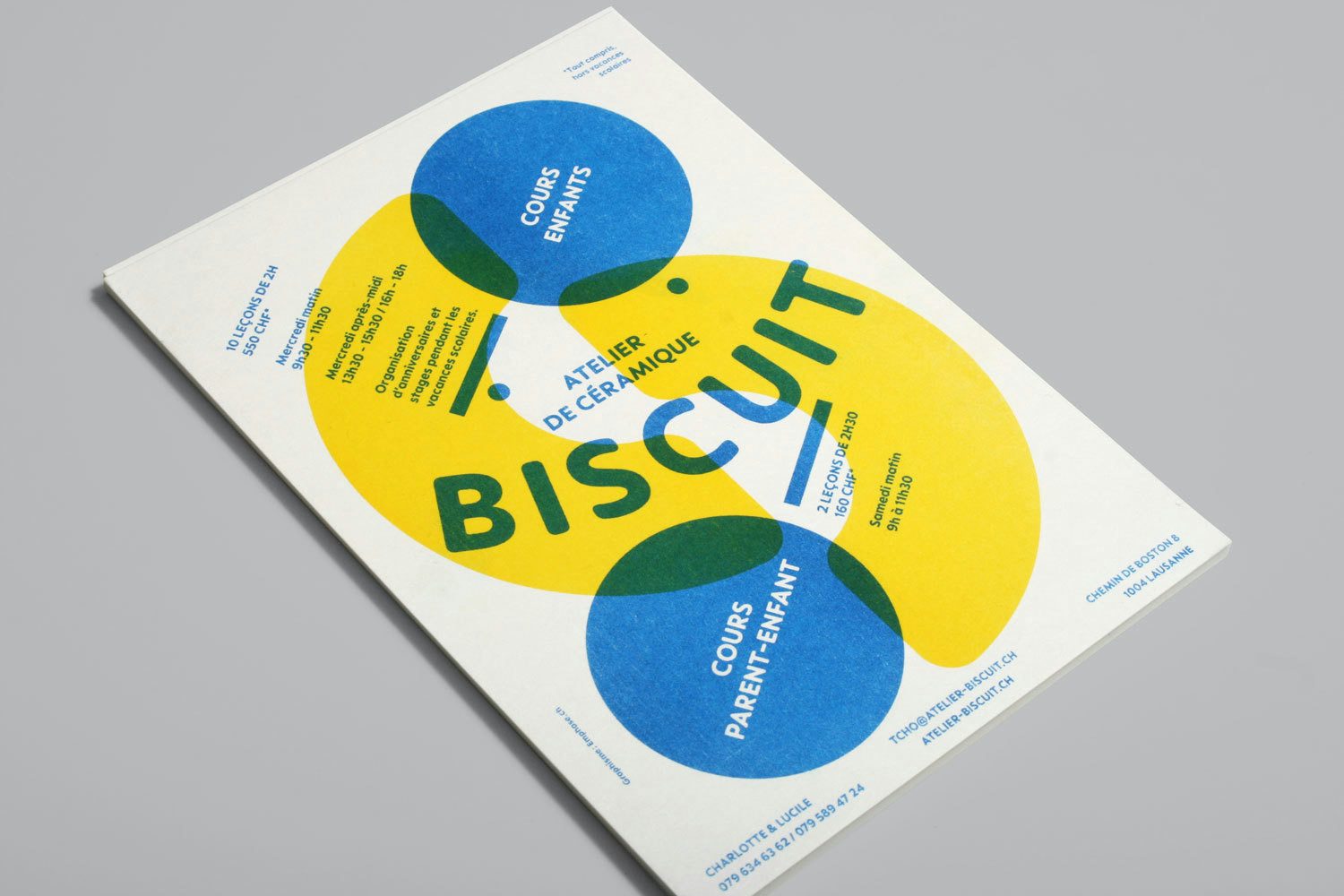
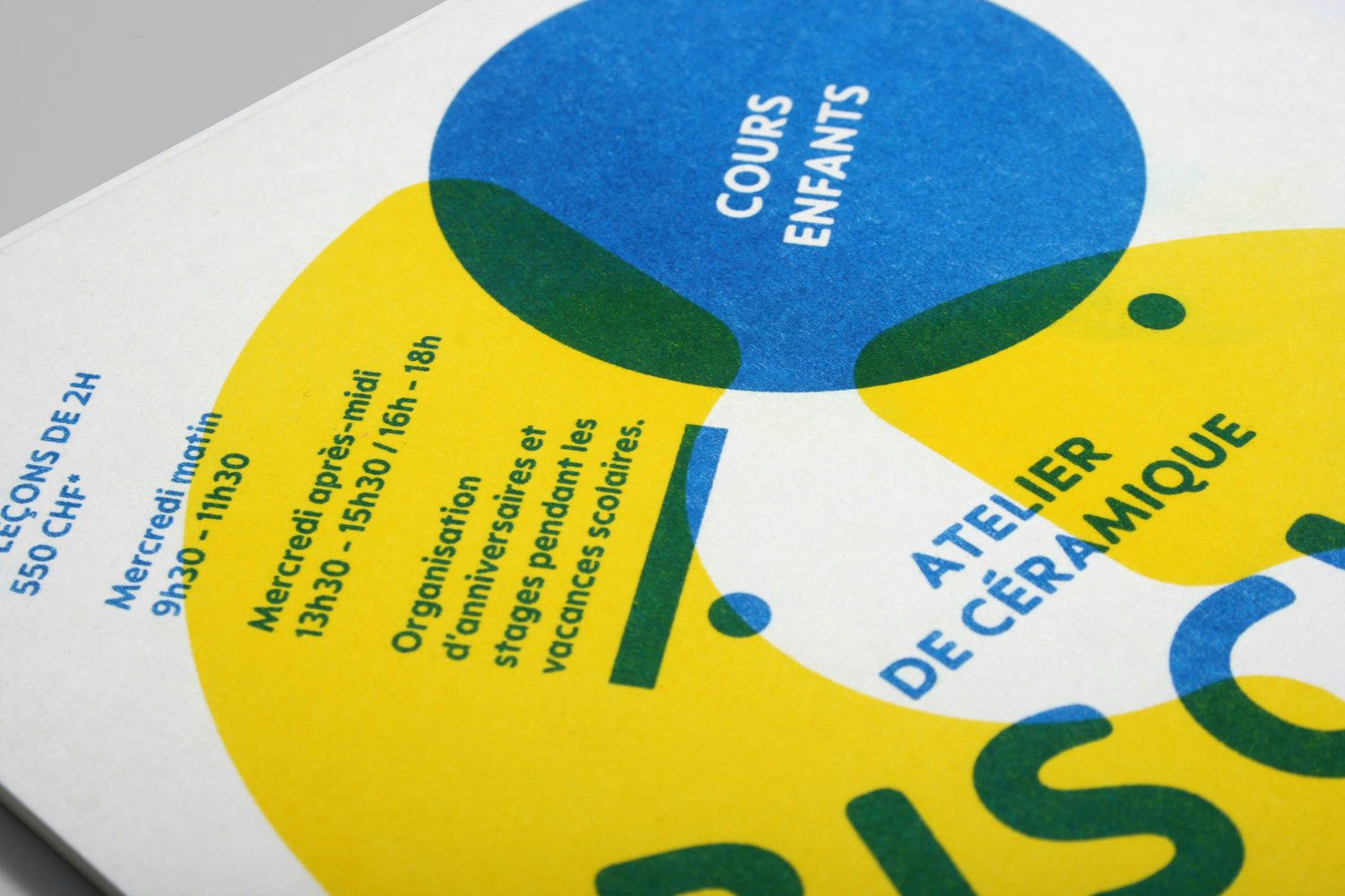
Design of the logo and flyer for Biscuit, a new ceramic workshop in Lausanne offering courses for children. The logo forms a "smiley" thanks to the dots of the two "i", the whole with a rounded font to evoke the childish universe. The flyer is printed in Riso in two colors and plays with overlays.
![03 BISCUIT](/_next/image?url=https%3A%2F%2Fcms.emphase.ch%2Ffiles%2Ftransforms%2F_default%2F03-BISCUIT.jpg&w=1920&q=90)
![04 BISCUIT](/_next/image?url=https%3A%2F%2Fcms.emphase.ch%2Ffiles%2Ftransforms%2F_default%2F04-BISCUIT.jpg&w=1920&q=90)
![05 BISCUIT](/_next/image?url=https%3A%2F%2Fcms.emphase.ch%2Ffiles%2Ftransforms%2F_default%2F05-BISCUIT.jpg&w=1920&q=90)
![06 BISCUIT](/_next/image?url=https%3A%2F%2Fcms.emphase.ch%2Ffiles%2Ftransforms%2F_default%2F06-BISCUIT.jpg&w=1920&q=90)
Other projects