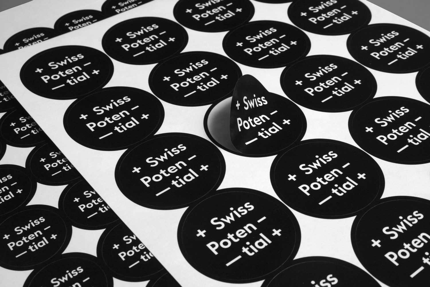
Visual Identity – Swiss Potential
Design of logo and visual identity for SwissPotential. Emblematic, clear, distinguishable, stringent. The crosses symbolise the Swissness of the label and, in combination with the hyphen, are at the same time plus-minus signs and thus a symbol for areas of tension and operational functionalities.
Because: The young company puts dynamic management consultancy, coaching and intercultural mediation from head to toe. Holistic solution approaches, consulting and support mandates on the three political levels (municipality, canton, federal government) are just as much part of the portfolio as communication and learning projects, nature and social events.
Services:
Logo, business cards, stationary, stickers
Typeface:


Other projects