Corporate Identity – Resoplan
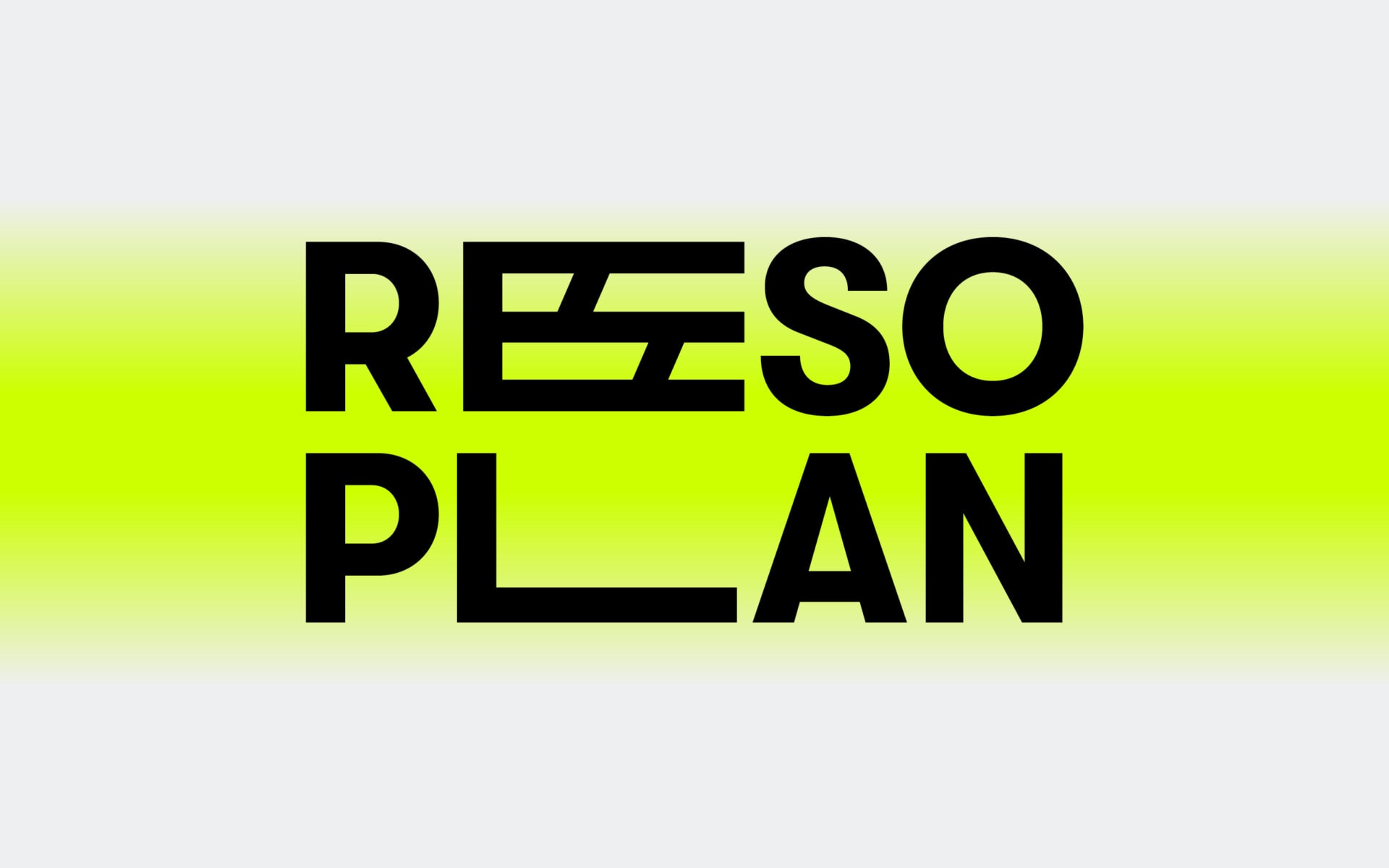
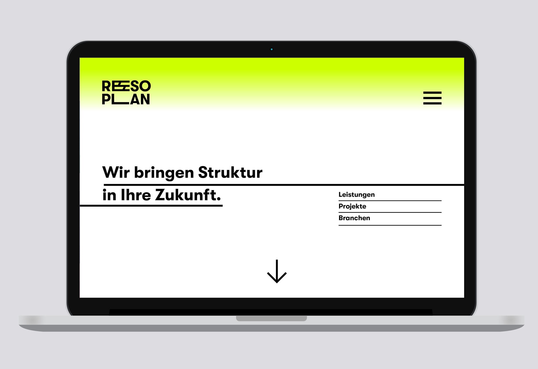
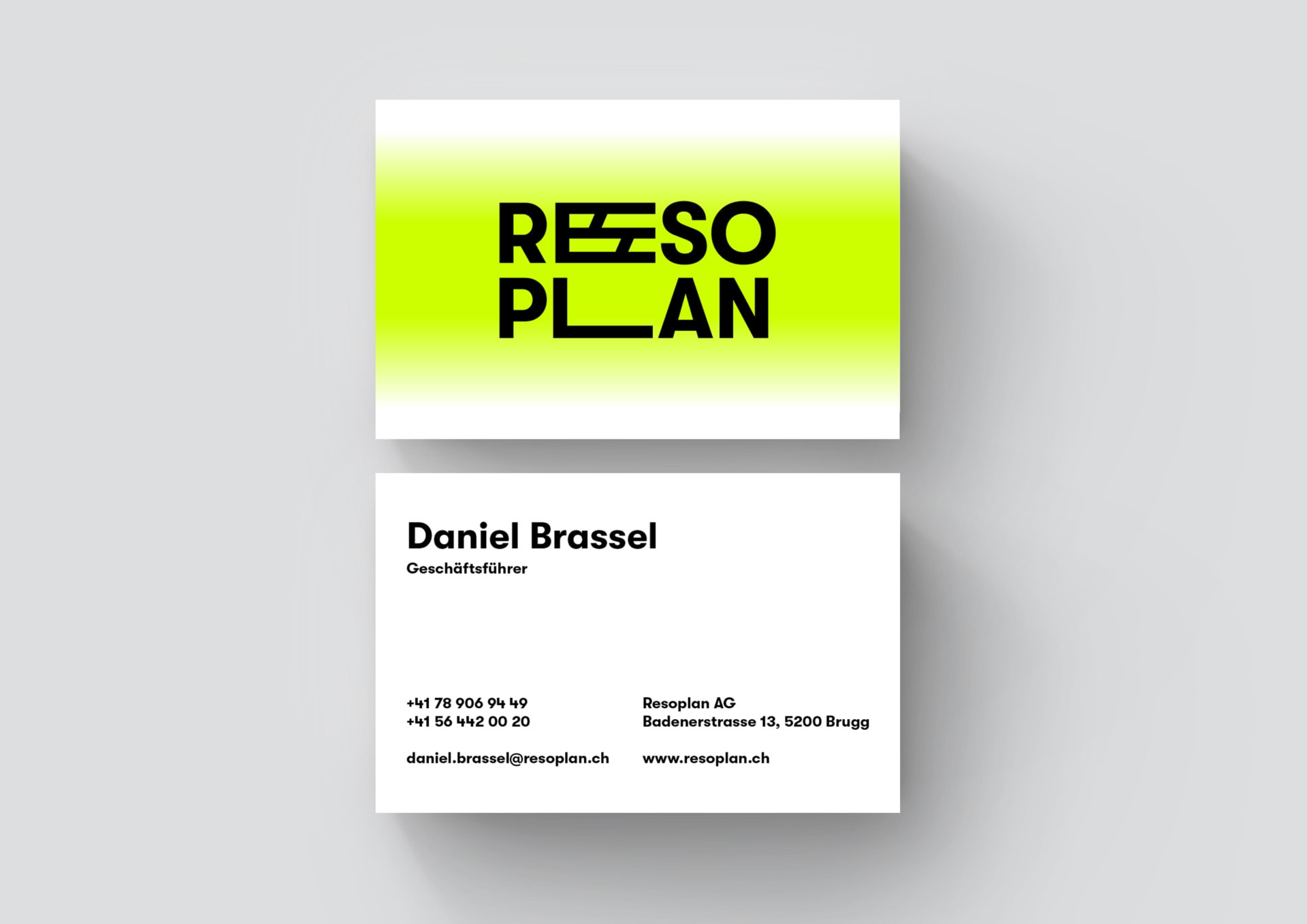
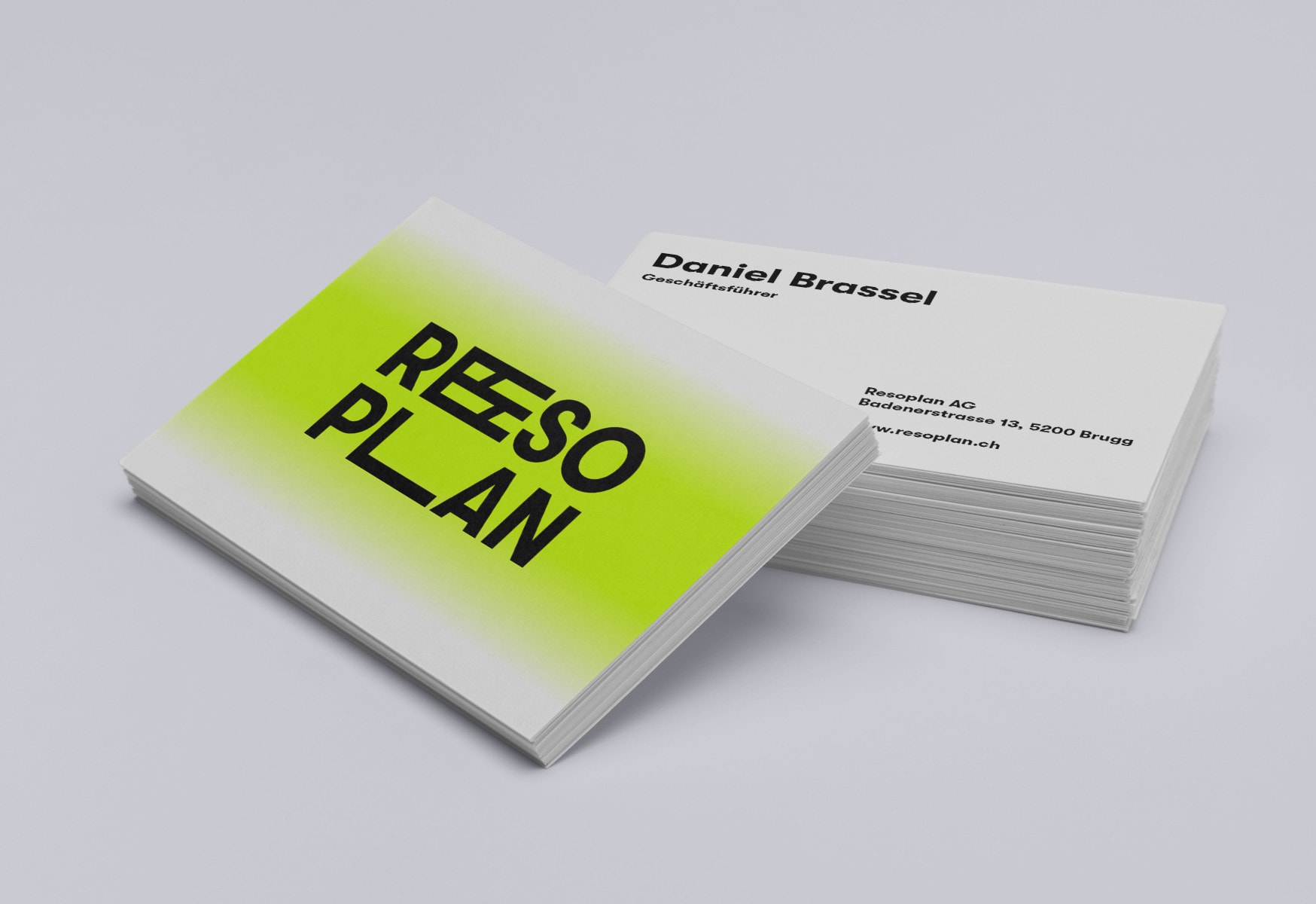
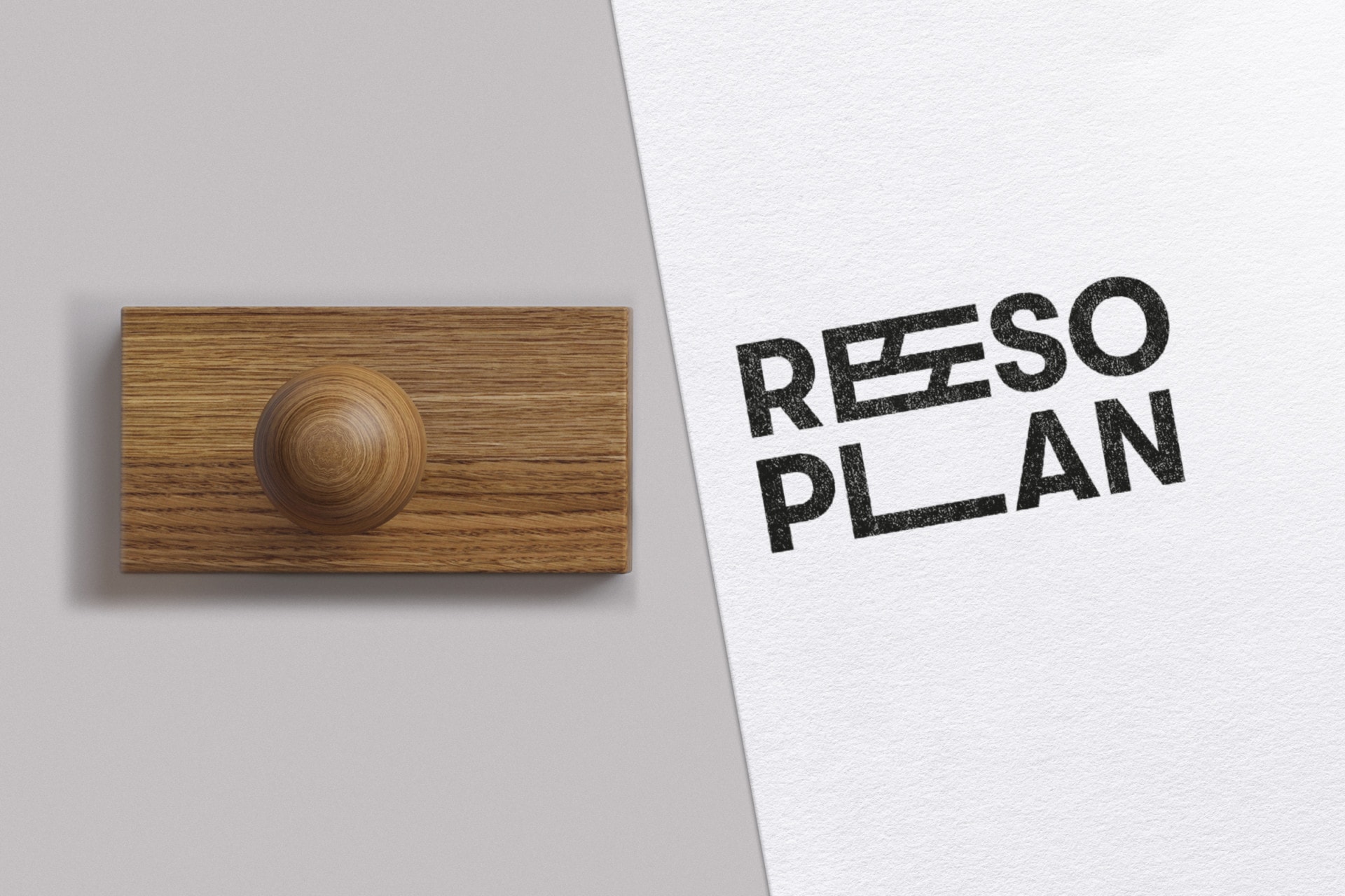
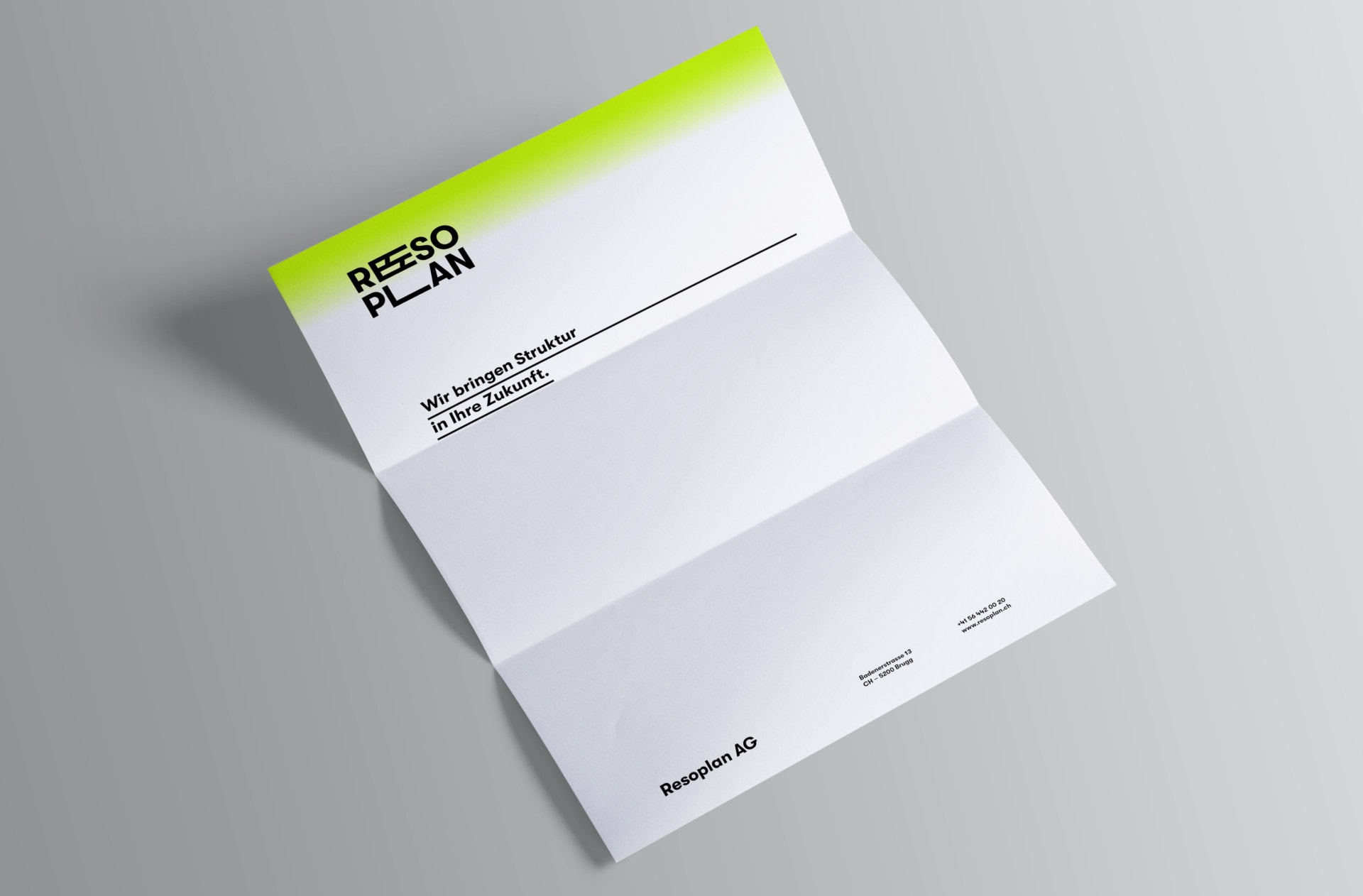
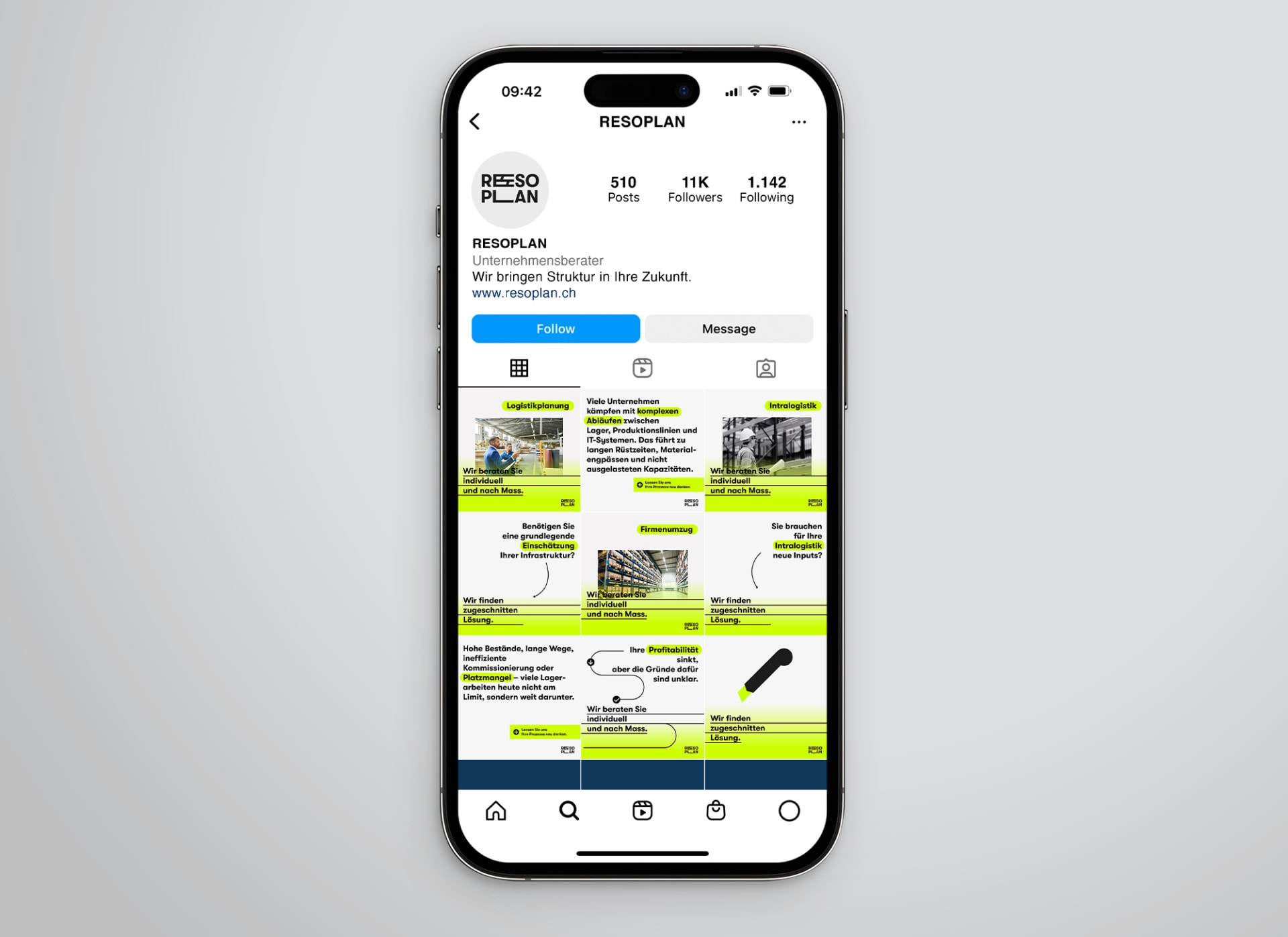
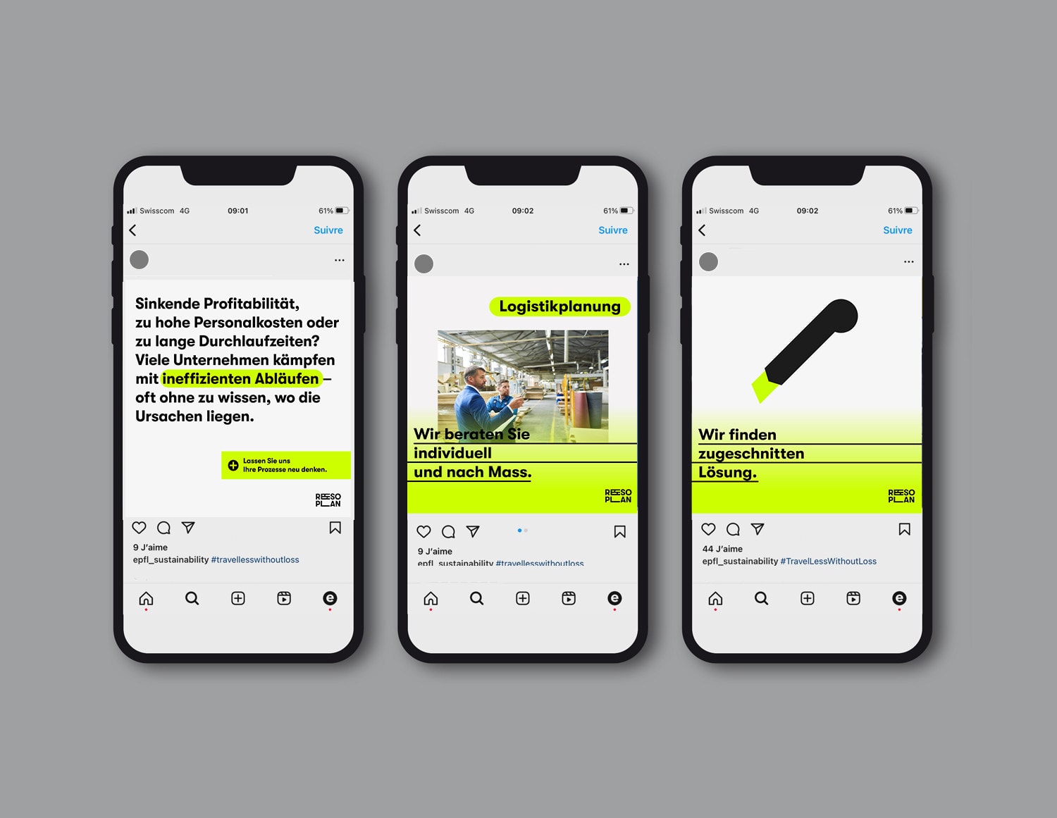
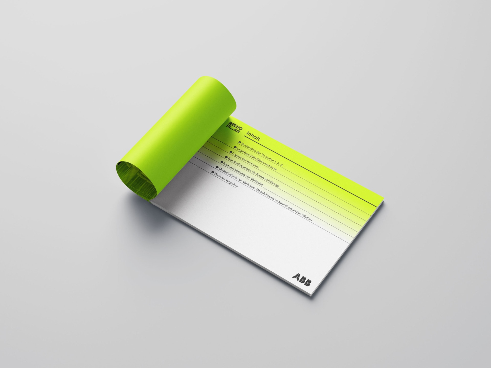
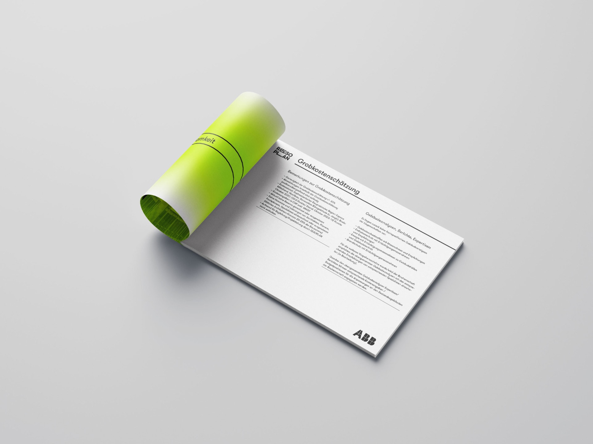
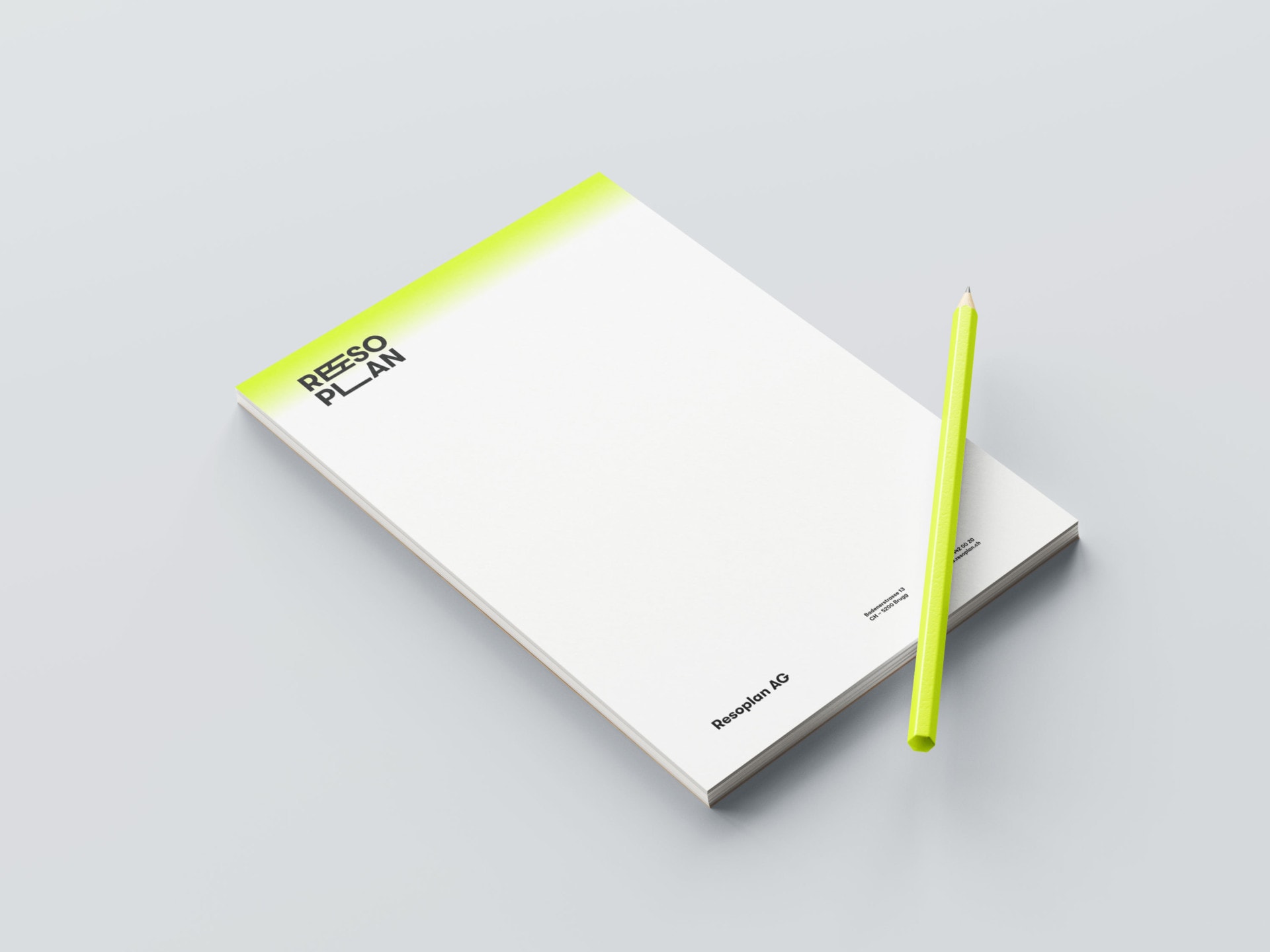
Corporate identity for the logistics and planning company Resoplan: The linear, structured logo embodies clarity and an overarching perspective – precise planning with a view of the whole. Its reduced formal language conveys efficiency and reliability, while the dynamic lime-yellow gradient introduces openness, movement, and a sense of progress.
The contrast between the sharp, black typography and the vibrant highlight color creates a visual tension that unites professionalism with energy. This interplay forms the foundation of a flexible design system and a consistent visual language.
Client: Resoplan
Services:
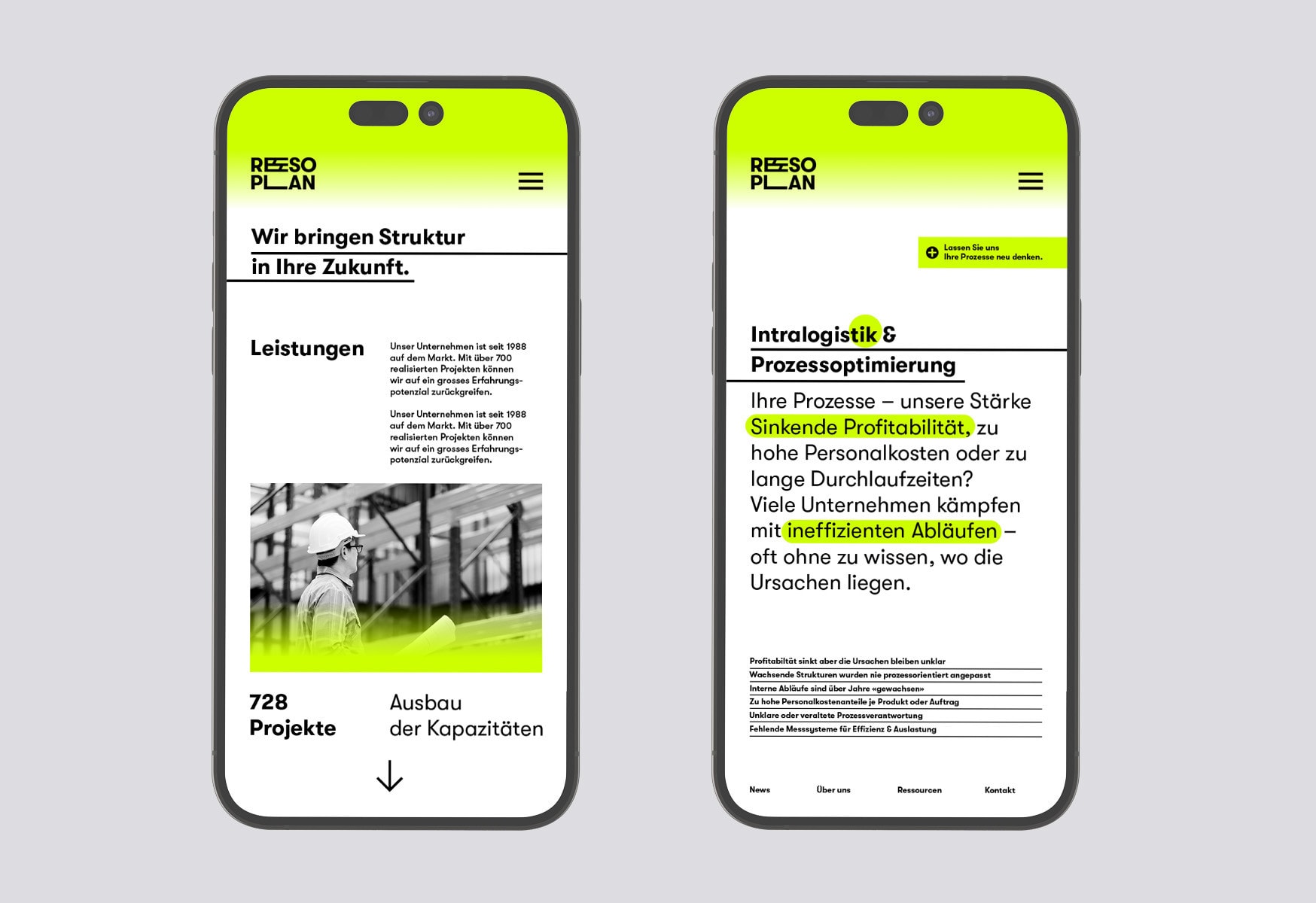
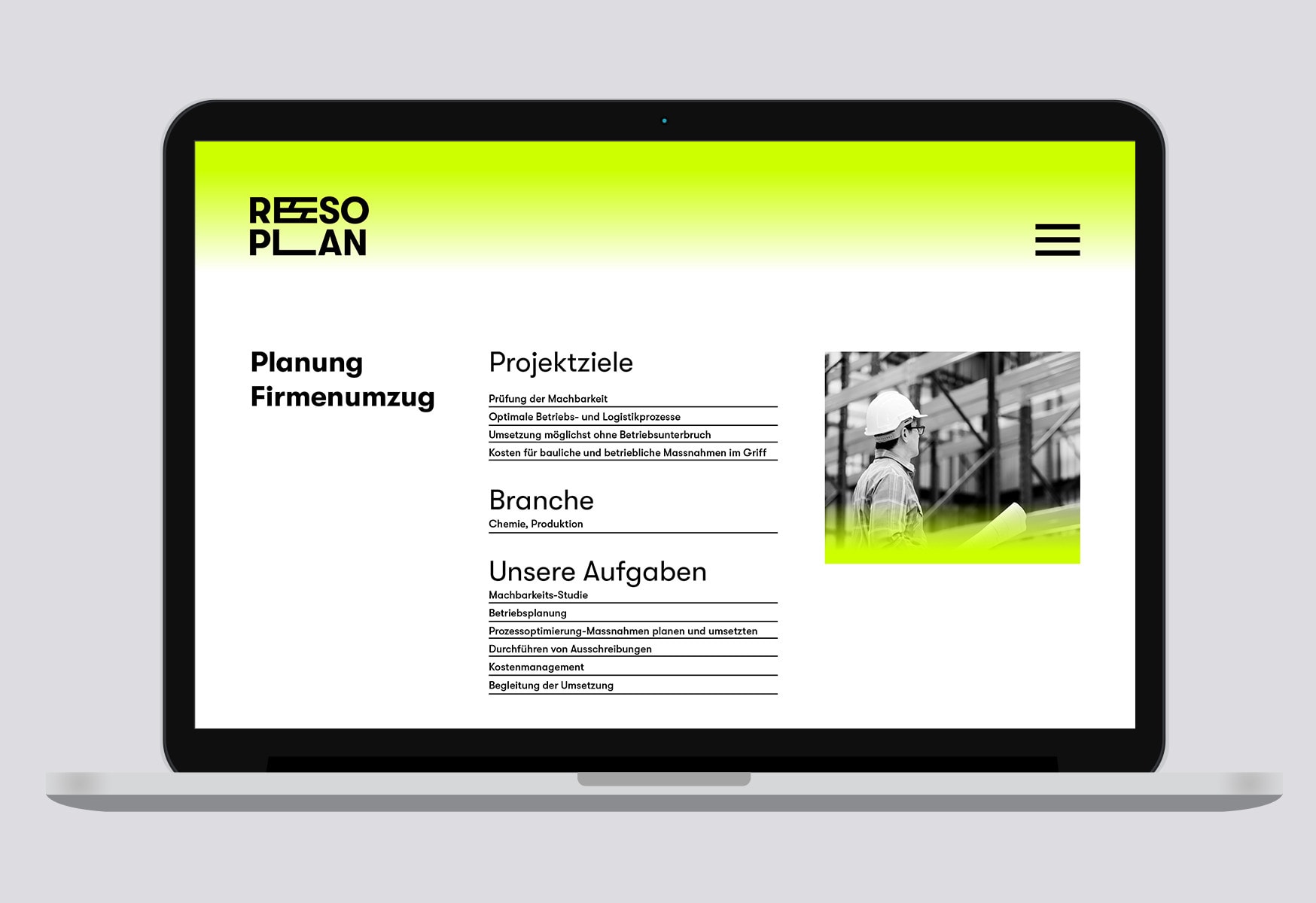
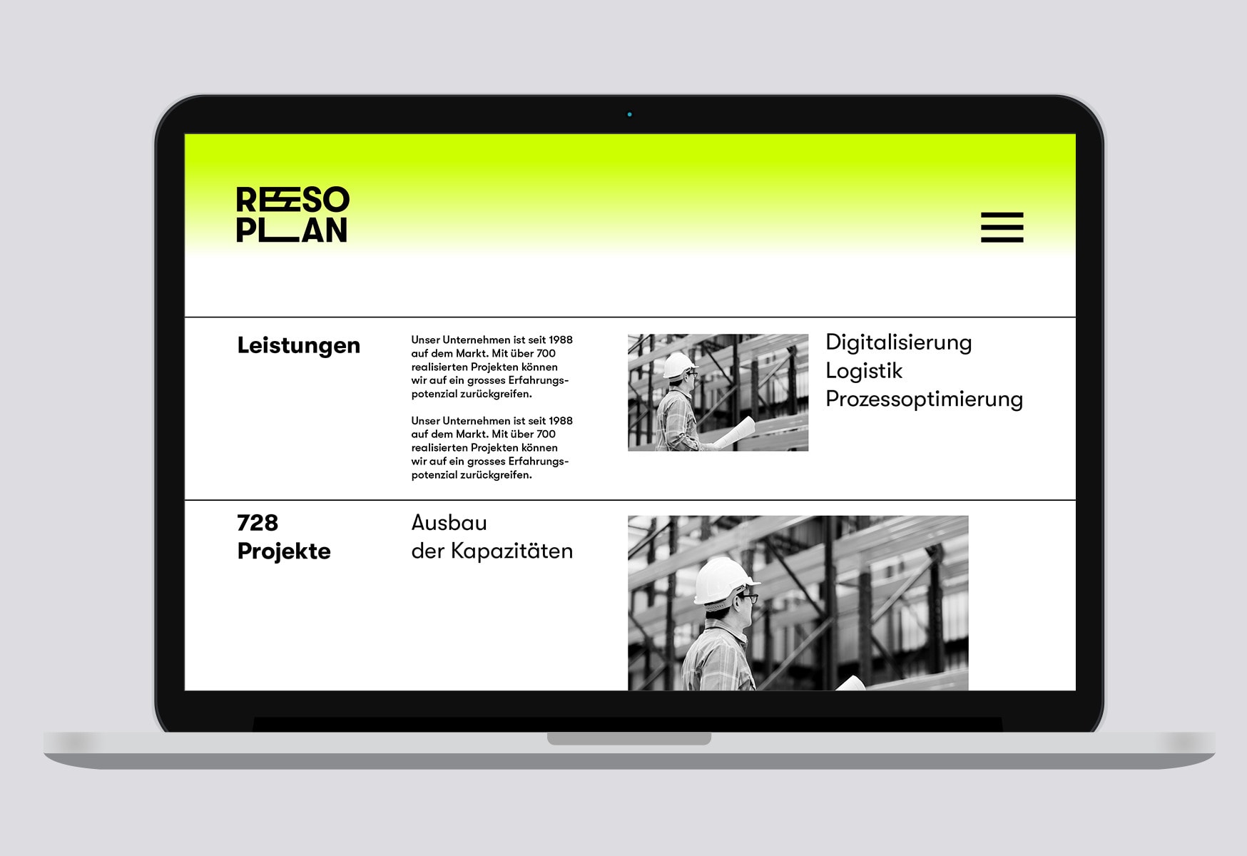
Logo, stationery, corporate brochure, infographics, website, social media campaign
Collaboration:
Website development: Diff. Kommunikation AG
Printing: RickliWyss AG


Other projects